This was my first time working with a green screen (and a portable one too!). Turned a classroom into a holodeck complete with Star Wars ships using Adobe Premiere. Ship models were borrowed from a game box and photographed using a Canon 350 DSLR.
This was my first time working with a green screen (and a portable one too!). Turned a classroom into a holodeck complete with Star Wars ships using Adobe Premiere. Ship models were borrowed from a game box and photographed using a Canon 350 DSLR.
From a single hi-res jpeg, we had to cut it up in photoshop and then use the pieces in Aftereffects to give the illusion of movement. Again, all with a single image.
My first attempt at a video this semester:
This project is meant to give us practice with the mesh tool in Illustrator CC. Our Instructor has given us a picture with four different colours of peppers:
 Breaking it down, each pepper and stem will need their own mesh. Finally if there is time, I can possibly do the shadows. A classmate was saying that he needed four hours to do the yellow pepper (What was he doing exactly???) He had a point about it though; it did need a lot of meshes added on before it started to look real enough. Glad to have learned a few shortcut keys (U – Mesh Tool, A – Direct Select Tool, I – Eyedropper, and Shift+C – Anchor point tool).
After 2 hours, this are the results:
 Clearly the shine on the peppers will have to be revisited when I get the whole composition. The yellow pepper required the most splines, so doing each point separately got tedious and I ended up selecting a few at a time to save time. Not the best work, but I have other classes’ projects requiring my attention. The red one was not as bad, so the multiple selection of points worked better. Update: Got some surprisingly positive feed back that the peppers looked real enough, so I will move on.
Finally I am done… at least for very basic work:
 Whole thing (Minus Shadows) took three hours. Perhaps with another hour or so I could get it looking perfect enough, but enough wishing, I have a JavaScript quiz tomorrow that needs to be studied for. The good old question: hand in mediocre work or try to do your best?
Turns out the quiz will be next week, so I do have time to at least work on the shadows:
 My hypothesis that doing the shadows would be easy enough did not quite work that way. I have to deal with a gradient effect that was missed from the first assessment. Unfortunately I need to submit this for grading soon and again, the good old excuse of other classes/projects needing my time. Perhaps Lynda.com might have a lesson on time management?
I should have had something up weeks ago, but done is done. My assignment (due before the reading week) was to find some line art/concepts done by artists on DeviantArt, get permission from them to use it, seek the prof’s approval of at least one of them, and then “ink” and colour them. This is Risell, a character from a work of fiction done by an artist named Eclaira. My primary challenge, aside from using a reference that is smaller than ideal when in close up is the texture of her hair. It was suggested that I break it down into blocks, or rather, teardrops and work on the hair that way. The delay in getting too much done is due to difficulty in learning the ropes of my Javascript and animation classes. So with that flimsy excuse out of the way, I need to stop now for yet another class. Will continue afterwards. 
 Hope it’s not too badly butchered. 😛 05 March 2015: Reading week doesn’t feel like reading week. My instructor was not kidding about the hair being the hardest. It took a few hours before getting the hang of drawing out the strands. From prior knowledge, this is the way to draw hair in Manga. Unlike using the pencil/pen though the single hair strands do not end sharp with the pen tool. Tried to experiment with joining two strands of hair at their ends, but the original sketch is not always thick enough to allow that. Hopefully when zoomed out the difference will not be so obvious.
 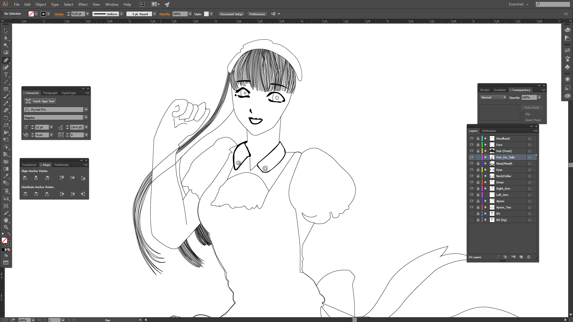 Trace of Risell complete:
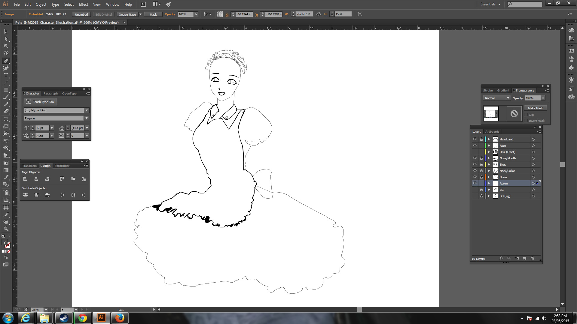
  I hope it can live up to Eclaira’s standard. I had to redo the apron and the maid’s headgear since there were too many black patches that were shadows rather than actual lines. 12 March 2015: ARGH!!! I had an accident with my hard drive. Thankfully I had a back up device, but Risell’s sketch is minus the colours. There goes my chance for some sleep AND I have to tell the teacher. With what I could get done in an hour for Risell’s base colour:
  There were no colour references for Risell, so I have to go by memory from what manga stereotype maids wear. This is by no means anywhere near done; the instructor is allowing me to hand it late with the warning about late penalties. Better prepare TWO pots of coffee tonight after class and a nap. As for what to tackle next the folds and the shadows of the apron, Shadows under her neck, shadows under the skirt. I’m not a big fan of the gradient tool, think I will do it by mesh this time. Risell is finally back to where I had her yesterday. Glad I took the time to study her more carefully as I discovered that her legs were not right and left as I thought. Apparently she is doing some kind of folk dance that only Eclaira can explain.
  Anyways I just have to finish her arms and the shadows before I can start on the mesh. But first I need to go home, eat and get some sleep before I can continue.
DONE!!! The mesh tool I figured out, but my project is late and needs to be handed in. Whatever my instructor gives I’ll take; to me, the important part was figuring all this out. I still need practice for getting the most out of the shading, but the mesh tool allows me more control over the gradient effects.
 Thanks to Eclaira for letting me practice on her art and forgive me if I butchered it. 😛
There is a saying among the US Navy seals about the only easy day being yesterday. The same applies to every subsequent semester in college/university, so its a good idea to never hope for breaks from the profs until they actually give it. However as usual, no matter how hard you try to get ahead in your schoolwork things still have a way of passing you by. In the end it is all about getting by; get the homework handed in, show up to classes, try to participate (even if unwilling), etc.
Going back to school after an absence of about half a decade was not an easy decision. There were the usual fears of; “You are ancient by comparison to 75% of your classmates,” “What about finances?” and the usual stuff which plagues all post-secondary students regardless. Then there was also the fear of losing out on a few lucrative jobs that might show up.
But in the end, the following events made me decide to go through with it:
The Army was “phasing out” severance pay and offered us the choice to either take what we were owed or leave it for our actual retirement. I was advised to take mine out due to the fact I had been in for a long time. Long and short of it, I ended up with 10 grand after taxes and other things had been deducted. I put half into investments and the other half paid off the rest of outstanding debts I had been struggling to repay. What remained was enough to get me in for one semester. OSAP would cover the rest.
I had a run in with a few “Friends of a friend” who were university grads and an MD mixed in. They were in their mid twenties with their lives ahead of them and thought that a college drop out approaching his mid thirties was beneath them. Never again will I have anythig to do with them if it can be helped, but the positive spin was it reenforced the need to graduate with at least a diploma. After that, it would not matter much if I ended working as a farmhand somewhere for the rest of my life.
The final push came from a former professor in the program I dropped out of. He listened as I told him of my plans and difficulties then gave me the name of the Program Coordinator. “Go find him in his office and talk to him in person,” he said and wished me luck. The rest is history.
I left my church in 2005 as there is no place in my life for organised religion, but still believe that someone upstairs wants me to do something. Over the years oportunities have been given repeatedly “to make something of it” and I almost always turned them down. Why? I don’t know, most likely a lack of confidence in myself. What matters now is to make the most of this next chance and move on.
This is the advice from all the professors before the semester ended: Practice what you have learned on personal projects and blog about it. There will always be nay sayers: find a way to deal with the trolls and keep moving ahead.
 Nice! Now, note to self: The only easy semester was last semester.
Sometimes the toughest part of any project or endeavor is not the execution but the concept of execution. Although I am guilty for being hypocritical of this, I want to believe that there is no such thing as a bad idea, but bad execution. So hammering out what you want to do vs what can actually be done can be a nightmare.
So with that rant out of the way, this is one of the first of three final major projects. We each have to come up with a series of web banners for a hypothetical iPhone 6 campaign for Bell. Here is the concept art for the Large Rectangle format:
![DSC_0013[1]](https://householdgamingmedia.files.wordpress.com/2014/11/dsc_00131.jpg)
Basically I want these two pics:


To make this:

 From slamdunk.wikia.com
 Credit Matt B
When I was a kid there was this manga/anime series called Slam Dunk. It was popular in Japan and Taiwan, giving us another set of heroes to emulate. The main hero was a guy named Hanamichi Sakuragi, who began the series as a punk. He met this girl, Haruko Akagi who introduced him to the game of basketball. Although effectively getting friend zoned by Haruko, by the end of the series Sakuragi had changed into a more respectable and responsible person (albeit still arrogant and hotheaded).
That was the inspiration for this INM 155 project: Anime Hockey game soundscape. My classmates and I threw together sounds from slam dunk, NHL from EA, and other games to make an anime themed hockey. The exaggerated asian accents were done by Sam and myself, and most of the editing by Matt. A little fun and humour for us and we just got graded on it:

For the last assignment in INM 101, I have to create a web mock up. The specs said any company worked as long as it wasn’t automotive or from Apple. After considering a few gaming and aerospace industry sites, I settled on doing the gaming section of Creative Assembly’s Website.
 This is very helpful… Instructions on how to take screenshots on a Mac.


If any job offer were to make me drop everything and run, it would be a job offer from Creative Assembly. I have enjoyed their entire series of games for the PC from Shogun in 1999 to the recent incarnation of Total War: Rome 2 Emperor Edition as well as their love of history and the effort they put into making their eras interesting and fun. Only Lucasarts might have superseded CA, but that is very unlikely now.
I was advised to consider rearranging the order of CA’s games portfolio. Unfortunately that was only for starters, something new had to be done to its look as well. After studying the layout of the original for half an hour, I started sketching.
Since CA had a history associated with war gaming, i thought a smoky/foggy background would look cool with text and horizontal scroll bars altered to complement it. The horizontal bars were intended to show side scrolling graphic links for CA’s games divided into their respective eras.

After an hour’s total, this was the basic layout of my mockup.
Doing the graphics turned out to be the most tedious part of the assignment. I had to alter over a dozen jpgs down to 300×200 pixels. In hindsight, I wonder if maybe those same images could have been turned into PNGs.
 Work on this took about 4 hours. It might be a good idea next time to relearn the record actions.
 This is the final result, pending a possible review by the Instructor. Total time is around 12 hours for this assignment. Could I do it faster next time? Definitely.
